Flat planning through the preliminary tasks:
In the first lesson we had to go out in small groups and take photographs of other students (including ourselves) in our class and pick one of the images for the front cover of our magazine. The criteria of the photo was that it had to be from the waist up, the person in the photo had to be making eye contact and everyone in the group had to be in at least one photo. After we had chosen the photo we wanted on the magazine cover, we had to then put in onto Adobe InDesign.
Here's my group photograph:

My reasons for not choosing this picture would be due to the quality of it. The image itself looks quite blurry and therefore would not be a good picture to have on the front of my magazine.
This is the photo I chose for my magazine cover:

My reasons for choosing this image, is that its different from a typical medium shot due to the fact that there is two people with only half of them being shown on each end of the photo. Its a unique and looks like quite a modern picture.
However, before we could start to design our magazine cover on Adobe InDesign, I had to create a drawing plan of the layout and positioning for all the various things that I would need to include on the cover. This would allow me to analyse whether or not my final design would look good, or whether I need to improve various aspects of it.
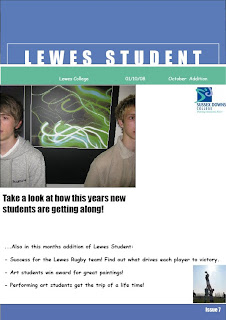
Final Design:

The colours I chose for the magazine cover are very relevant to the college as the logo is the same colour. This is therefore easily recognizable. The main head of my magazine is bold and easy to read. The main head gives a nice affect to the page due to the letters fading into the thin white strip above the turquoise border. I positioned the picture to the left as it adds a different dimension to the page. It also gives the impression of creating more space and allows easy reading as things aren't bunched up. The smaller picture in the bottom right hand side on the page is relevant to the text along the bottom of the page. This allows the reader to know what some of the information will be about.